Facebook Track
Awwwards

The Brief

The London based boutique houses multiple designers, many of which have chosen Este in the UK to house their collection exclusively. Opening their doors as a Bridal wear boutique, Este noticed a demand for designer Pret, exquisite jewellery and must-have accessories.

From our first conversation with Este their vision was clear 'We want to stand out and we want to be different'. Our challenge was to deliver on their objectives and amplify their core values. Creating a presence for Este that instantly makes people stand back and take notice. Pushing boundaries, daring to be different and ignoring their competition, we delivered on what we call a perfect brief, branding, design, web and marketing.

Works

Design

Web

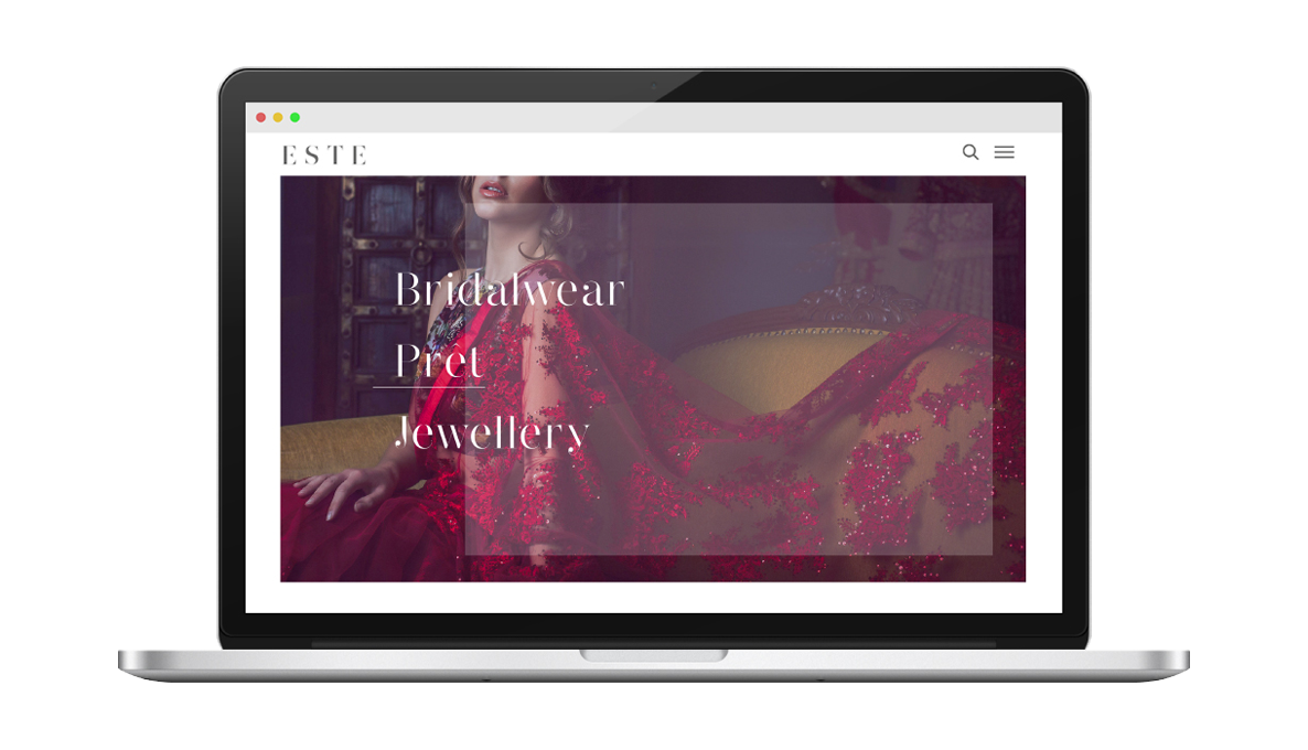
Este Couture's website on a device

What makes Este special?
What potential did we see in them?

When designing a website, it's important to focus on what makes the business special, and what will speak most to the customer. So what did we see in Este that was special? Easy. Their craft work is simply stunning, and anyone can tell that from even just a glance. On top of that, their dresses are vibrant and colourful, so of course it made sense to let them speak for themselves.

In this case, pictures were worth thousands of words each. That's why we made images the most prominent aspect in every part of the new website. What could we say that simply seeing Este Couture's work didn't already convey?

Inspired by Indian Heritage

What were the main difficulties in approaching this campaign?

Este Couture's existing site was already fantastic, so we knew from the start that improving on it was going to be a big ask. We knew that visuals were going to be our main focus for the campaign, but we also wanted to make sure that we kept all the elegance and usability of their existing site, or we'd be shooting ourselves in the foot. So, it was important to us to make a site that was both visually stunning but also simple to navigate and easy to understand. These are very much the cornerstones of our design philosophy.

Este Popout Copy
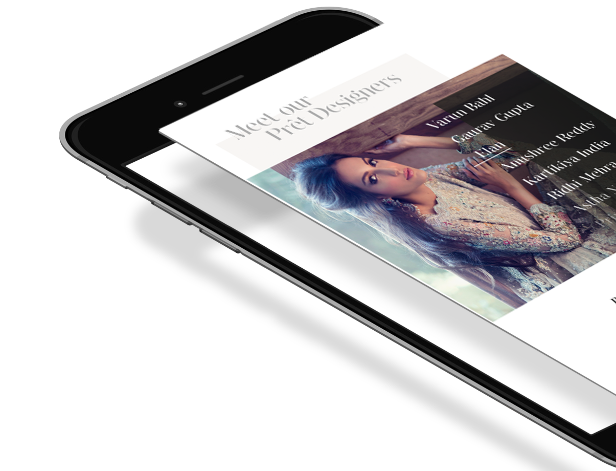
Este Couture on a Phone

What were the main
objectives for the campaign?

Este Couture's designs are Indian inspired, bringing in fashion lines from famous Indian fashion designers as well as their own bespoke ranges. However, these designs have a global appeal, and the main objective was to emphasise the appeal of these dresses for anyone who wanted one.

Este Couture's main customer base are wedding parties - both the brides themselves and the bridal party, bridesmaids, mothers or even just guests. It was important that we kept weddings at the tops of our minds, while also showing the everyday appeal these dresses could have for women who just love to look beautiful. We made weddings our main objective, while still making sure that the broader appeal of Este Couture was appreciated.

So what did cefar do for Este?

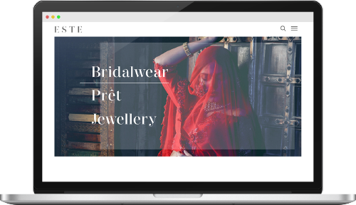
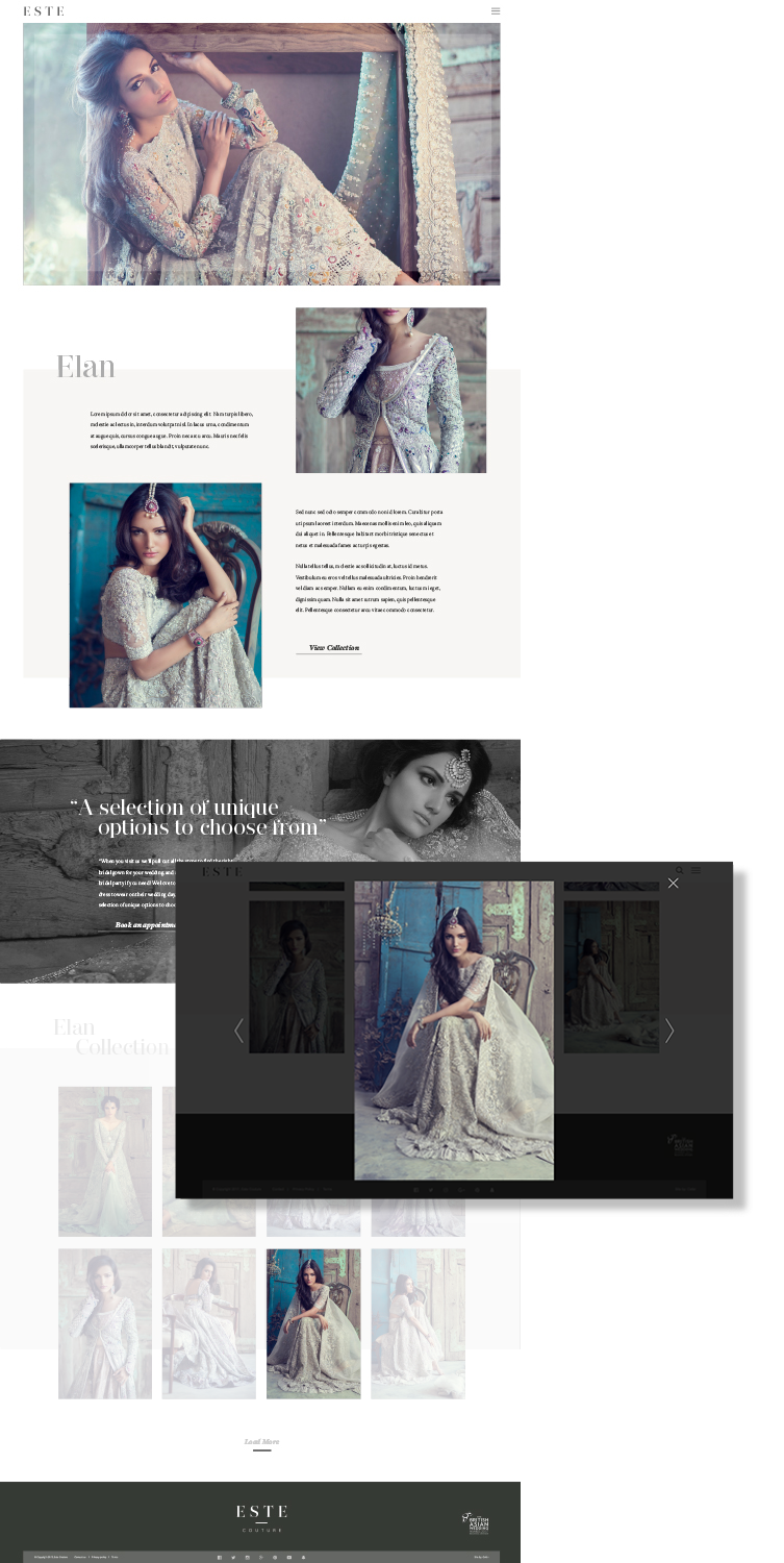
So, knowing our main objectives and what we wanted to focus on, how did we translate that into an improved new site? We leaned heavily on our in-house designers to come up with a wire frame to start, and then put it into action. We kept some of the ideas of the old site: an image carousel with quick, easy access to the main sub pages, but in this case we tucked the main menu away and emphasised the 3 core services straight away. These links are independent of the image carousel, so that users can always interact with them, and with the main menu tucked away they don't have to worry about other options until or unless they're looking for something more specific.

This means that new customers are immediately shown the main focus of Este Couture, and where to find more information.

Customers who have visited the site before don't have to use the carousel to find the link they're looking for, and also have access to a more detailed menu which doesn't need to take up valuable space on the front page to include every available option.

You'll also see that we inverted the core background colour from black to white. While black definitely conveyed style and elegance, white did so just as much, while also making the site seem lighter, more open and more approachable. Even while some elements take up the same amount of space, the white background gives the appearance of openness that makes the whole site seem less cramped.

Este Couture Banner
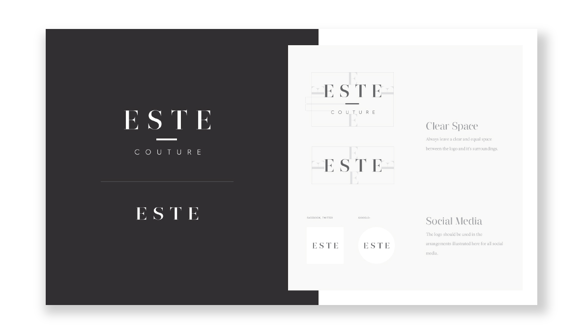
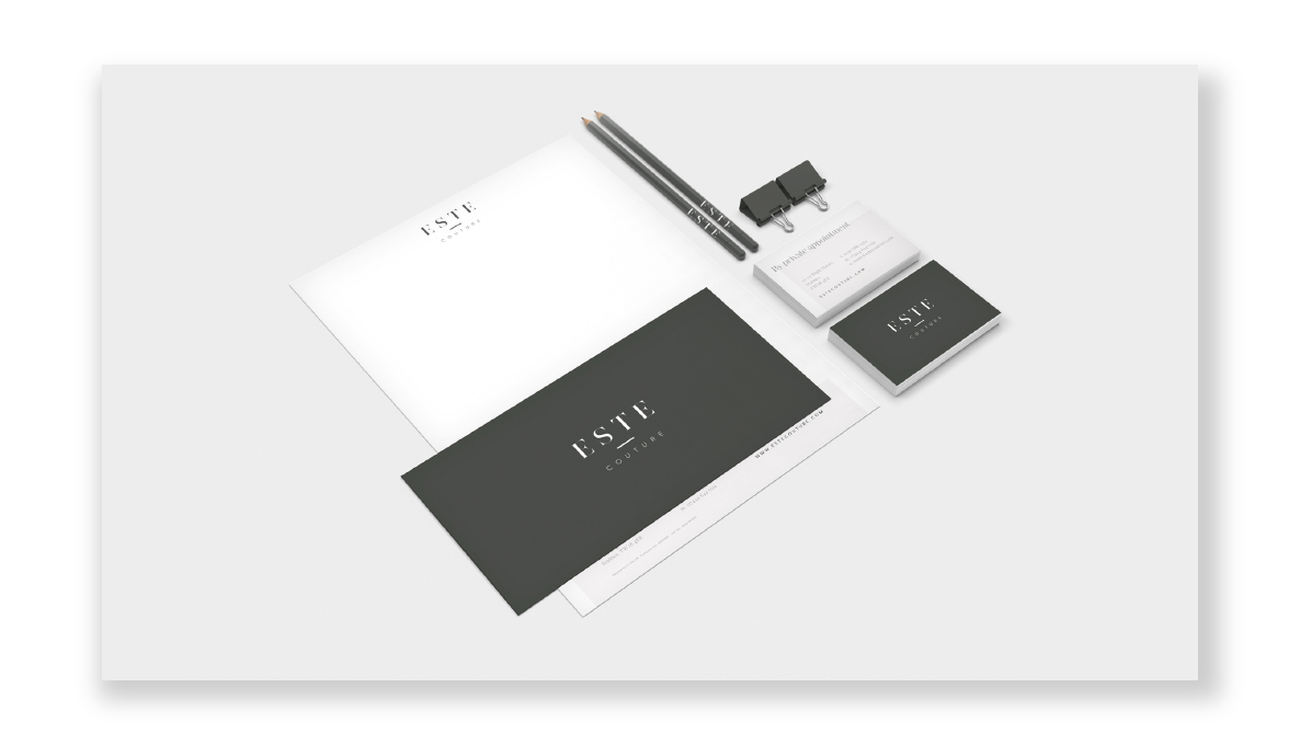
Este Couture Logo Design
Este Couture Stationery
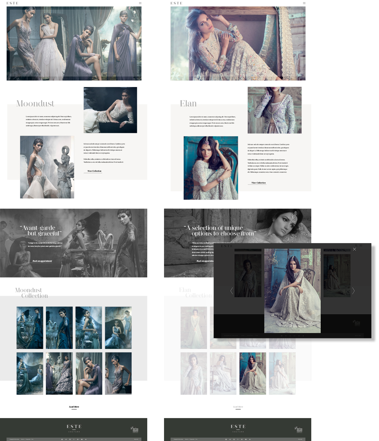
Desktop version of Este Couture

Finally, since we were building the site from the ground up, it was vital to us that it was also mobile-friendly. We're long past the point of mobile browsing being vital to the online experience, and while Este Couture's existing site was mobile friendly, we wanted to add consistency to that experience. Now, the mobile site matches the desktop version much more closely, so that multi-device browsing is simple and easy.

Visit Website

How are Cefar expecting the improvements to help?

So what exactly do we expect to happen as a result of these changes? In short, lower bounce rates, increased visitors and increased enquiries.

Este Couture has a long conversion cycle, and much of it starts here, so we don't expect massive changes overnight. We never do. These things always take time. What we expect is that an improved website experience, especially with multi-device consistency and a more impressive hook, will draw people in to browsing the site for longer, and eventually booking an appointment. From there, of course, Este Couture's fantastic team and products can do the rest.

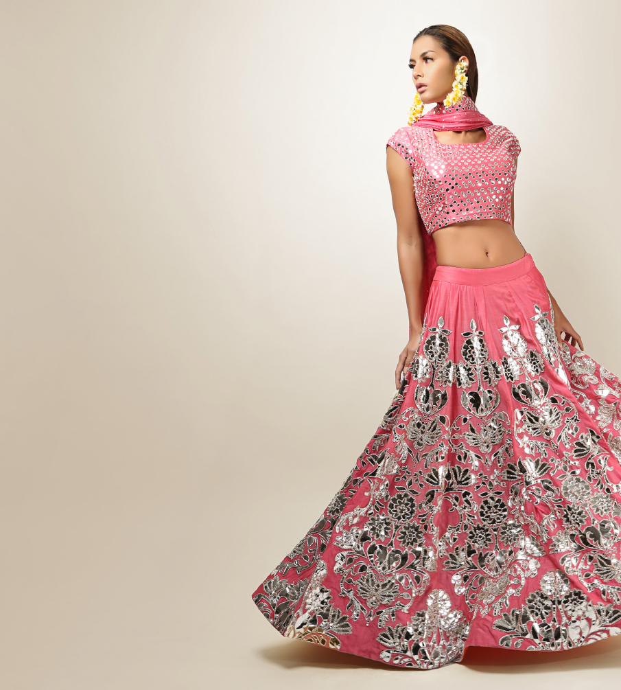
Person dressed in Este Couture
Fashion Popout Copy

How will Cefar measure
the results of the campaign?

We'll be keeping an eye on the ongoing effects of the new site primarily through analytics software, but also through Este Couture themselves. As much as it would be nice to believe that every conversion they make is because of our hard work, we'll only be able to claim victory if we see their conversions increase significantly from here.

Other measures of success will be visitors to the site, and their behaviour once they're there. Bounce rate is important, since it measures what percentage of people are immediately put off by the site. We expect this to go down, of course. Time on site and pages per session will measure whether people are browsing the site more now that it has a new design. We'll also be keeping track of people's behaviour on mobile, tablet and desktop, and see the results of multi-device browsing and how it leads to conversions.

We'll be comparing all of this data to how the previous site performed to measure our improvements, and if anything seems to be doing worse we'll be quick to jump on it and figure out how to improve it again. Unfortunately, as excited as we are to see how these results turn out, it will be some time before we can say with certainty how much success we've seen. Perhaps we'll revisit this in a year or two to keep you updated.

Double Elan Design Layout Single Elan Design Layout

What are the plans
for the future?

One of the most important plans for the future is to see how the new site performs, and how we can improve upon it even more. We have some expectations for how well the new site will do, and if it lives up to them, that's great, but it won't stop us from making more improvements wherever we see them. Of course, if the site doesn't perform as well as we expect then we'll definitely be looking at why that is, and focusing on that.

Once we've had a good look at how the site is doing, we'll be polishing up and then looking at what our next steps will be: focusing on a new line? Improving social media performance? Increasing advertising spend? It all depends on the needs of Este Couture, but we're always prepared to pivot to whichever strategy will offer them the most benefit.

Next Button
Previous Button